


Designing easy site navigation
 Frequent site usability error is complicated or confusing navigation that pushes customers away. Remember a simple rule: the easier it is to navigate on your site, the faster the user will find the necessary information and, possibly, will place an order.
The basic principle of easy site navigation is to make sure that a potential client always understands which section / page he is on, where he came from and where he can go next. Let’s see what navigation elements need to be added to the site so that the user does not “get lost” in the depths of your resource.
Creating a site navigation: the main elements
The following elements are the main ones that should be present on all pages of the site and be in the same style. Their absence confuses the user.
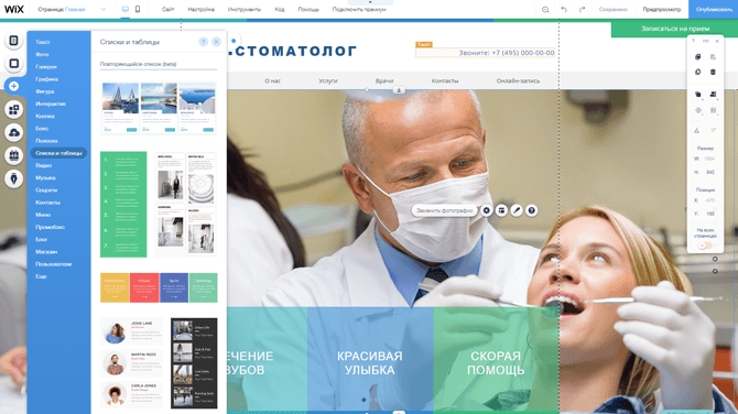
Site header. It must be visually separated from other elements of the page and contain the following elements:
The logo, which is better placed in the upper left corner, as this option is more familiar to users.
The company name and a brief description of the activity is tagline (if this information is not indicated in the logo). Additionally, you can specify your USP (for more information on what it is and how to choose it, read here).
Regions of work, delivery of goods. It is not necessary to list the entire list; indicate this information briefly.
Contact Information. If you have several offices or shops, then in the header of the site you should indicate important information only for the main thing in order not to overload the header.
Next to the phone number, be sure to add the mode of operation so that users can see at what time you can call the company.
Link to the cart page if you have an online store.
Order form callback. Add only if your specialists have time to promptly process applications from her. It is necessary for those users who for some reason cannot call the company themselves.
An example of an informative site header:
Links to social networks are better not to post in the header, so as not to lead users away from the site immediately. Tell us about your accounts in social networks in the main part of the page and / or in the basement of the site.
Main menu. It is best to place these links horizontally under the site header. When choosing titles for sections, do not forget about semantic design. The main sections that should be in the main menu:
Catalog of services or products (drop-down menu item).
Page about the company.
Methods of payment and delivery (for online stores).
Warranties and returns (for online stores).
Portfolio (if you have something to show).
Promotions and discounts.
Reviews (for service sites).
Blog (if any).
Contacts.
The list for each site is individual, but for easy perception we do not recommend placing more than 5-7 links in the menu. If there are more, you can select the second menu above the site header with links to auxiliary sections, the so-called “service” menu. An example of a website header with two menus:
Site cap with two menus
Also links to additional sections, for example, to company vacancies, can be shown only in the basement of the site.
Visually highlight the active section of the menu so that the user can see which section he is in. An example of selecting a menu section:
Search form. Must-keV for large sites, especially for online stores and information portals. About what it should be and where it is better to place it on the site, we discussed here.
Basement site. Many sites ignore this block, and after all, after viewing the page, it helps the user to go to another section or find additional links that are not in the main menu. The basement should contain:
Links to all sections of the site. At all, without exception. Duplicate links from the main menu and specify additional sections. Place them in columns and divide them into logical subgroups to make them easier to navigate.
Contact Information. It is better to specify in more detail than in the header of the site, adding the address and details of the company.
Links to social networks. Here they do not interfere.
Order form callback (only if added to the header of the site.)
The logo and company name to place in the basement of the site is not necessary, especially if you have a lot of links to sections. An example of a convenient site footer:
Convenient site footer
Additional navigation elements
Also help the user to understand the structure of the site, but not suitable for all resources.
Bread crumbs or local navigation. Shows the path traveled by the user, or the location of the page in the hierarchy of the site. It is worth adding if you have a multi-level site (nesting more than 2 levels). Recommendations for registration:
Must be on all pages of a site, except the Main.
Bread crumbs should be placed on the left below the main menu and in one place on all pages.
Use small font size.
All elements, except the last, should be links to the corresponding pages of the site.