slower site
Designing easy site navigation
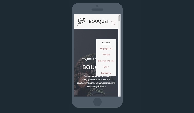
 Frequent site usability error is complicated or confusing navigation that pushes customers away. Remember a simple rule: the easier it is to navigate on your site, the faster the user will find the necessary information and, possibly, will place an order.
The basic principle of easy site navigation is to make sure that a potential client always understands which section / page he is on, where he came from and where he can go next. Let’s see what navigation elements need to be added to the site so that the user does not “get lost” in the depths of your resource. Continue reading
Forum or comments: what is better for business?
 In the process of developing the company’s website at a certain point, the challenge arises – we need a constant influx of fresh, relevant and unique content. He really likes it and search engines, and ordinary people.
In the area with regular updating of the range (when new products, books, courses, offers appear weekly), the product itself becomes the source of such content – the site is updated with pages with its description. You can add content from users – reviews or comments to the product. Continue reading
Step by step: improve the download speed of the site
 Nobody likes the slow site – neither users nor search engines. With the current speed of the Internet, people are no longer ready to wait long for the page to load. This is not a dial-up connection, where waiting was inevitable. And the search engines, fighting for the quality of search results, do not want to give out bad (in this case, slow) sites to users. Therefore, other things being equal, the slower site will be lower in output than its more nimble competitors. Continue reading


