


How to create a mobile site
 Since 2015, search engines have paid attention to mobility, which has become one of the aspects of ranking in extradition. So Mobile Friendly is not only a concern for visitors, but also an important condition for promoting a web resource.
Best services for creating a mobile site
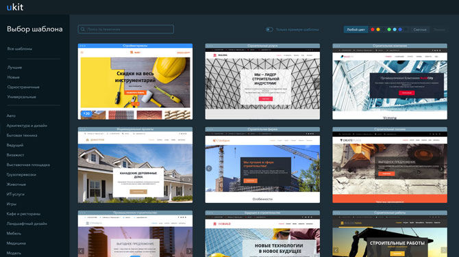
If earlier, to create a mobile version, at least knowledge of HTML and CSS was required, now you can solve the problem with the help of site designers. Popular services offer adaptive templates that do not need to be customized separately – by default, they display the content correctly depending on the screen resolution. From the point of view of the convenience of creating a website and the number of adaptive templates, two designers are the best – uKit and Wix.
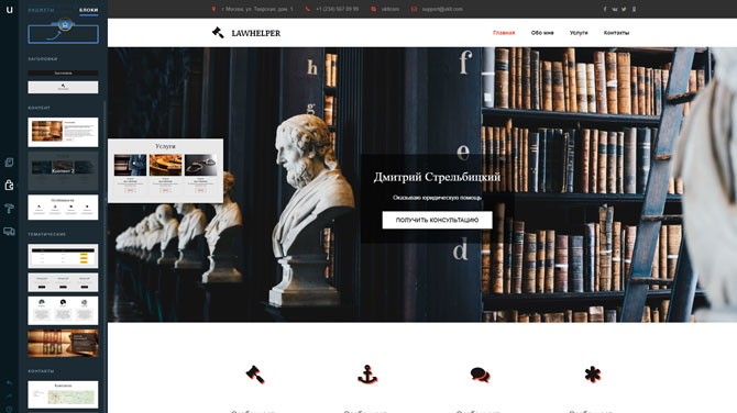
uKit is positioned as a service for business sites, so there is nothing surprising in the fact that it offers all the necessary tools to create a high-quality mobile version. On this constructor you will find:
Adaptive templates, divided by areas of activity. When choosing a template, it is possible to switch between different screens to see how the layout is displayed on the desktop, tablet and smartphone.
A large number of blocks and widgets, originally focused on different screens.
Widget settings that allow you to adjust their size in height, width, content or screen.
Preview the site on different screens and in different orientations.
The content of the mobile version of the site created on uKit fully corresponds to the desktop one. Therefore, all changes made to the site will automatically be displayed for all types of devices.
To create the most unique design, you can add your own CSS code (on Tarifa Pro) to the site, which will complement the standard style of the template. In addition, using the HTML insert widget you can integrate almost any third-party service on the site.
Wix launched mobile site optimization in 2013, two years earlier than it became an important ranking factor in search engines. All this time, the function has been improved, so now Wix can offer:
A huge selection of mobile-ready templates made by professionals.
Blocks and applications that adapt to the screen resolution and work correctly in the mobile and desktop version of the site.
Separate editing of the mobile version, which allows you to see what it looks like depending on the display device before publishing the site to the public domain.
Setting up a mobile site on Wix also does not require knowledge of programming languages. All actions are performed in a separate visual editor using the mouse.
Thus, the desktop and mobile versions of the site can be made different in terms of both design and content. Mega-convenient option when you know the behavior of the target audience coming from mobile traffic.
What should be on the mobile site
To be able to assume that the site is adapted for mobile devices, it must meet a number of requirements:
Simple navigation, which includes the main sections of the site in the main menu and the search bar within sight.
Drop-down menu, which is caused by touching the screen in a certain place.
Automatically adjustable width of images and other elements so that they do not go beyond the screen.
Place to tap to prevent accidentally clicking the wrong button or link.
Minimum situations requiring text entry. If you cannot do without a form, you should break it into several parts and place the lines at the top of the screen where the virtual keyboard will not overlap them.
Using the functional features of the platform – for example, calling the company with one touch of a button or launching a map with a route to the office / company office.
Creating a mobile version or adapting an existing template to the screens of smartphones is a difficult task. The meaning of responsive design is that pages are optimized for any resolutions, not just the most popular ones. Therefore, the use of designers significantly simplifies the task, allowing you to exclude work on the creation of several versions of the design.
findings
Using the designers uKit and Wix is the easiest way to get a site adapted to any device without any extra financial and time costs. In this case, the owner will not have to think about which elements need to be increased, which ones to remove, and how to prescribe all this in CSS styles.
Already at the stage of choosing a template, you can see how the pages will be displayed on the screen of a smartphone, tablet, laptop and PC. The visual editor also has the ability to switch to the layout for different resolutions and check how different elements are displayed.